By D. MAURICE KREIS,
Amateur Architecture Critic
HANOVER – John Stomberg, director of the Hood Museum of Art at Dartmouth College, let slip a noteworthy factoid recently while giving a tour of his newly reopened and newly expanded facility.
Showing off the expansion and renovation designed by the world-renowned New York architects Tod Williams and Billie Tsien, Stomberg casually mentioned that the Hood opted to stick with its existing location at the center of campus rather than move to a more distant spot that had been offered, which he characterized as being near the Connecticut River.
Instead, Stomberg said, that’s where Dartmouth will put the new central heating plant it recently announced plans to construct so as to stop burning oil and start burning sustainably harvested wood.
It isn’t necessarily an authoritative statement with respect to the new energy facility, which will need a water source but which could, if placed at riverside, dramatically alter the look and feel of the bucolic waterway that separates Dartmouth and its town of Hanover from neighboring Norwich, Vermont. But in architectural terms, Stomberg’s comment reflects a decisive and controversial move for Dartmouth as the state’s most well-resourced patron of the built world.

The original Hood Museum, completed in 1985, was the work of Charles Moore, the former Yale architecture dean who migrated to California and became one of the nation’s most eager exponents of so-called “postmodern” architecture. As it flourished in the 1980s, postmodernism was an exuberant rebellion from the minimalist look of the 50s, 60s and 70s.
In Hanover, it took the form of a friendly revolt against an abstract modernist brick complex opened in 1962, the Hopkins Center for the Performing Arts, designed by Wallace K. Harrison in what became the prototype for Harrison’s Metropolitan Opera House in New York. Moore got to wedge his Hood Museum between the Hopkins Center and a much older Romanesque building, Wilson Hall.
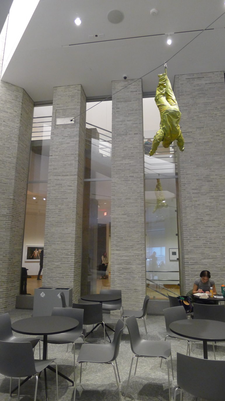
The Moore-designed Hood playfully bridged the Romanesque and the mid-century modern by using (to quote Architectural Record) “a cornucopia of arches, Egyptoid columns, Flemish bond brickwork, bullnose stringcourses, a rotunda, and much more. Inside, the museum was organized around a grand stairway intended to evoke the glitz and glamor of Hollywood, opening at its summit to a soaring multi-story gallery where hung, in recent years, a sculpture by the Spanish artist Juan Munoz called Figure Hanging from One Foot. The Munoz work does indeed appear to be a human body dangling by an ankle.

Postmodernism, as a legitimate architectural style worthy of preservation for the long term, is similarly dangling. Widely derided, even when new, as theme-park architecture – think of (or google) the exuberant and garish Swan and Dolphin hotels that architect Michael Graves at Disney World in Florida – it has been adjudged by critics to be too goofy in particular for citadels of academic excellence. Skip Disney World and head for Middlebury College in Vermont to check out the Mahaney Arts Center, completed in 1992 to a design by another avatar of postmodernism, Hugh Hardy. It is a crazy, and often ridiculed cacophonous village of a building.
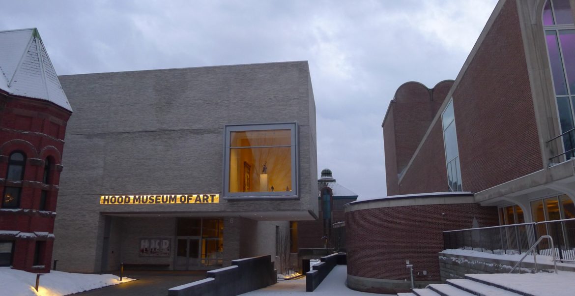
According to Stromberg, the decision not to uproot the Hood from its postmodernist home arose out of a desire to remain at the heart of the Ivy League campus. Indeed, the addition obliterates the north-facing Moore-designed portico, fills in most of what had been a serene courtyard, and provides the museum, in the form of the Williams-Tsien addition, a prominent and distinctive presence right on the Dartmouth Green.
In other words, the verdict is in. Charles Moore, your vision for what a museum should be, at a prestigious institution like Dartmouth College, has not withstood the test of time. There is enough evidence to support this verdict so that it should probably not be disturbed by the appellate court of public opinion.
Tod Williams and Billie Tsien are simply better architects than the late Charles Moore, the late Hugh Hardy, or the late Michael Graves were. A Williams-Tsien building is always an essay in restraint, with an emphasis on the beauty to be extracted from the careful and deliberate use of materials. Their approach to architecture spurns the expediency of postmodernism and reaches back to the finest American architect of the 20th Century, Louis Kahn.
So, if you’re as crazy about architecture as I am, here’s your itinerary for purposes of evaluating how well Dartmouth spent the $50 million it has just lavished on the Hood Museum. Head first for Exeter to check out the library Kahn designed for the Philips Exeter Academy. It’s the best building in New Hampshire; the concrete in the atrium is so lush and was so carefully cured during construction that you will want to rub it.
Next you should detour to Middlebury, Vermont to check out the wild and crazy postmodernism of Hugh Hardy. The performing arts center there is a carnival of shapes and decorative styles. Then make your way to Hanover.
There you will find a newly expanded museum that will earn its admiration quietly. The new galleries are vast, mostly white and arranged so that the art is not upstaged by the building. The excellence of the architecture speaks mainly through the quality and distinctiveness of the materials – oak floors, custom-made metal railings.
Both outside and in the capacious lobby, the brickwork (made in Denmark) is off-white. You could infer that this is the museum making its stand on the Green, rebelling against its red-brick neighbors, but I see the milky color as an homage to the museum’s chief benefactors, whose fortune was originally made in dairy.
In short, the difference between the old Hood Museum and the new is the difference between Ronald Reagan, whose sunny visage dominated the 80s, and Barack Obama, whose placid urbanity and sense of idealistic inclusion were the dominant theme when Williams and Tsien got this commission. Not coincidentally, they have also been hired by President Obama himself to design his Presidential Center in Chicago.
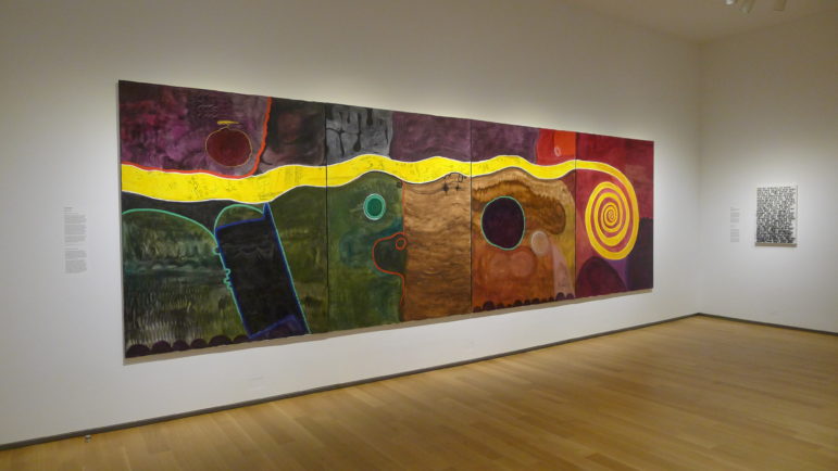
Happily, the Hood Museum is still free – and the expansion has allowed this inclusive spirit to suffuse the choices of what to display as well. The traditional, Euro-centric art is now relegated mostly to the periphery with the most prominent locations at the heart of the museum presently allocated to contemporary and historical art of Africa, Native America and aboriginal Australia.
The triumph is bittersweet. Surely even the most ardent Williams and Tsien fan must admit there’s something sad about Charles Moore being shoved aside.

Those who take that shove to heart can still make their way through the now-much-smaller courtyard and, passing beneath the remains the Moore building, emerge into a sun-dappled courtyard that has not been stripped of its compelling story about a half-century of contemporary American architecture.
Walk all the way to Lebanon Street, and now you are fully a block from the Green. Turn around, and take in the panorama.
To the left, the back of the Hopkins Center Spaulding Auditorium, capped with a series or arches and decorated with an Ellsworth Kelly art installation that endearingly resembles a series of paint samples. To the right is the Black Family Visual Arts Center designed by Machado and Silvetti and completed in 2012. Clad mostly in ruddy slate imported from Norway, this building projects a busy, friendly architectural face to downtown Hanover. And at center stage is what is left of Moore’s Hood Museum, its arches and brickwork and seemingly haphazard forms mostly undisturbed.
This courtyard is a counterpart to the Dartmouth Green – a plaza of the people, by the people and for the people. Perhaps the people should approach the Hood from this direction, a rear-entry strategy that leaves the Green to the privileged students who are forever and notoriously crossing the street with their faces buried in their smart phones.
Approached in this backward fashion, the new and improved Hood Museum can be appreciated for what it truly is – an act of architectural and artistic generosity, a building to be savored from the inside out, and an unambiguous rejection of postmodernism in favor of something more timeless.


